
Pareto charts are a very good way to tell how much of your total costs or effort is being spent on what number of tasks or items by percentage. Traditional Pareto cost analysis charts run on two X-axis’, with the left X-axis specifying the cost per item and a line graph pointing to the right side X-axis, which denotes the total percentage of cost.
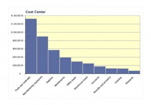
The Pareto Chart Excel Template that is downloadable for free from this page is a modified Pareto chart that makes it easy for you to work through the different cost items by cost center. It contains a cost center spreadsheet where you can enter all of the costs associated with different parts of your work process or manufacturing process and break the costs into separate categories. Once you are done with the categorization of costs, the chart will accurately show the different cost areas from highest to lowest, from left to right. The chart and the spreadsheet are easily customized to fit your needs.
How to Use the Pareto Chart Excel Spreadsheet Template
- Open the template and define the different cost areas that you plan to categorize your costs into when you enter your cost data.
- Enter your cost data for each category. Ensure that when you enter the data that you keep the format consistent.
- When you have completed entering your data, look at the chart that is generated in order to do a detailed cost analysis visually.
Tips for Using the Pareto Chart Excel Spreadsheet Template
- If you want to customize the colors and the labeling on the Pareto chart Excel, you can do so by right clicking on the chart and selecting the properties item and changing the features to match what you would like. You can add your company information as well.
- You can keep a running count of costs that you plan to enter by changing the spreadsheet to accommodate them. However, it may be easier to open another worksheet within the template that is blank and create a column of costs. You can then get the sum of those costs and either enter them into the spreadsheet, or you could link the spreadsheet to the worksheet that you made so that if you add costs to the worksheet, the spreadsheet is automatically updated.
- If you want a traditional Pareto chart with a running line that runs off to the right axis, rising to 100 percent of the cost total, you can enter total cost as a cost area and then hide that column. The result will be a higher left access that will allow you to render an accurate line across the data as it reaches upward.
Download: Pareto Chart Excel
Check this out while you wait!