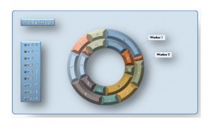
Using an Excel donut chart makes it easy to explore different perspectives or certain pieces of a chart. It can compare how quickly different tasks take employees to complete to see if someone needs to be encouraged to work harder. The template for a donut chart is easy-to-use, downloadable and free, and it can be customized. This allows the finished product to be unique to the company’s needs, so anyone can create a quick, polished and professional document.
How to Use the Excel Donut Chart
Donut charts are ideal when more than one data series is being used. Like pie charts, they’re circular and small parts can be compared to the whole by adding additional rings. Viewers should be able to glance at a donut chart and easily understand the distribution of the different percentages being portrayed in the data series. It has some elements of a traditional pie chart, since some similar details might be all of the same color.
Using an Excel donut chart can make it easy to compare how percentages have changed over time. For instance, it could be used to explore the percentage of dogs adopted from a shelter in every quarter in 2010, 2011, 2012 and 2013. Each quarter of each year would be easy to compare to the same quarter in other years and the the rest of an individual year.
Tips for Using the Excel Donut Chart
Reading the donut chart can be difficult, so it should cover as much of the screen as possible. When it’s larger, it’s easier to read and easier to comprehend. To make the chart fit the size of any computer screen, go to “Sized with Window” from the menu bar after the chart is complete.
To make a series of data stand out more, “explode” it. This involves separating the different sections of the Excel donut chart. This is particularly helpful if each section only represents a tiny portion of the data, since having it separated makes it clearer.
Pull out different slices of the Excel donut chart to highlight them or focus on them. It’s also possible to rotate the slices of the donut chart so that a different data series becomes the primary focus.
An Excel donut chart is an easy way to compare several streams of related data. The free template is easy to use and customizable, so it can fit anyone’s needs.
Download: Excel Donut Chart
Check this out while you wait!
