
17
Jul
Because everyone learns differently, it helps to have multiple formats of portraying information. A matrix chart is a useful tool in this case, helping those who learn more visually. It is also good for comparing and contrasting data, displaying crosstabulations, and representing contingencies that contain two or more variables.
Making your presentation even more impactful is a breeze with this matrix chart template. It is a compatible option for presenting the research of any project, in social sciences and business especially. This template is easy to customize and downloadable from this page.
How to Use the Matrix Chart PowerPoint Template
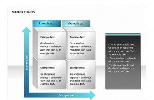
- Use the example text of the vertical and horizontal axes for independent variables. The style of this matrix chart is formatted much like a time management chart. A time management chart has the independent variables of importance and urgency. These variables could be placed along the arrows, which indicate the task’s level of importance or urgency from lowest to highest.
- Use the quadrants to display the dependent variables or contingency information. For example, a long term goal like saving for retirement could be placed in the top left quadrant. This would be the case for a vertical axis that represents importance and a horizontal axis that represents urgency, which would mean that saving for retirement is highly important but not as urgent
- Write any pertinent data that corresponds with your study in the two tabs saying “Example text.” This text is optional if your presentation is going to use the format of a time management chart.
Tips for Using the Matrix Chart PowerPoint Template
- Adjust the color, font, size, and any other aspects of the chart so they match the branding and aesthetic elements of the presentation.
- Swap out the arrows of the axes for different shapes that don’t represent movement or increasing variables. You can also delete them altogether if there is no relevant data to go along those lines.
- Provide an explanation or a summary in the text box on the right hand side.
- Print out notes sheets for the participants if this presentation will be shared with a live audience. There is only so much room in the chart to explain the data.
Download: Matrix Chart
X
Your free template will download in 5 seconds.
Check this out while you wait!
Check this out while you wait!