
Multiple types of charts can be easily created using Excel. Chart creation in Excel includes bar graphs, pie graphs, and many more. Using the tutorial data, you can learn how to make different charts in an Excel spreadsheet.
Download the example to learn chart creation.
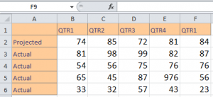
In the example spreadsheet, there is data from two quarters of a business year. You can learn to create a chart in Excel using just this data.
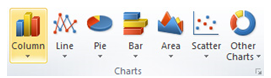
Click anywhere within the data, such cell A1, then click on the “Insert” tab and access the charts section:
Excel presents options for line, column, pie, bar, area, scatter, an array of other chart types.
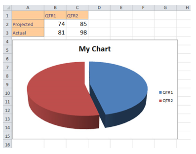
Click on the chart you want, in this example we will use the pie chart option. By clicking the chart, you are able to move it around and re-size the pieces. The default title provided is “My Chart”, but by clicking it you can rename it.
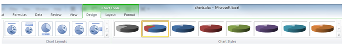
In the Excel Tool Ribbon, the multiple “Chart Tools” appear when you choose your chart. With these options, you are able to alter the layout and styles of your chart.
There are also three tabs for further customization: Design, Layout, and Format.
“Design” is the default tab selected. Click on the other ones to explore more options.
In the “Layout” tab, you are given the ability to work with title formats, legends, and data labels.
The “Format” tab lets you work with shapes and text in the chart.
Check this out while you wait!